Goal
The goal is to redesign the MediCamp website to improve the user experience and help interested peers seamlessly navigate and find relevant information.
Duration
3 months
Skills
User Research, Prototyping, Human Centered Design, HTML/CSS
Role
Web Designer | Web Developer
Tools
Figma, Photoshop
Design Process and Planning
Research/current experience
I conducted interviews with 5 students (non-members and members of the organization). From the data, key issues were identified based on design principles.
•unclear navigation and unbalanced information architecture
•overwhelming content layout/excess amount of category options
•overall disunity between information content and UI animation
Website View
Mobile View
Competitive Analysis
Analyzed and compared existing organization websites to explore and gain valuable insight on the commonalities of how information is organized. I discovered key patterns that each website followed.
•simple header located at the top of each page with a few category choices
•high contrast between background and displayed text/images
•established typographical hierarchy by drawing the user to larger texts such as the title and leading the reader down the page
•clear and non-repetitive labels on the page
• short homepage description about what the organization entails
•consistent background and text color
Affinity Diagramming
I used the affinity diagramming method to organize my research findings and analyze the information by interacting with the data. I arranged the raw data I collected into 5 overarching issues the current website faced.
1. overall website layout
2. informational hierarchy / font
3. logo placement / menu + footer
4. images / gallery
5. mobile layout
Persona
To further my understanding of the users’ unmet needs and frustrations, I used the data I collected from conducting interviews and information I analyzed from the affinity diagramming process to navigate and construct two personas.
Sketching out wireframes
I went through the different stages of wireframing to visually plan out my ideas before moving on to the html/css phase of this project. I produced a few sketch variations and different designs using grid, content, and images. After choosing a candidate, I iterated and explored variations of that theme using the feedback I had received from MediCamp members.
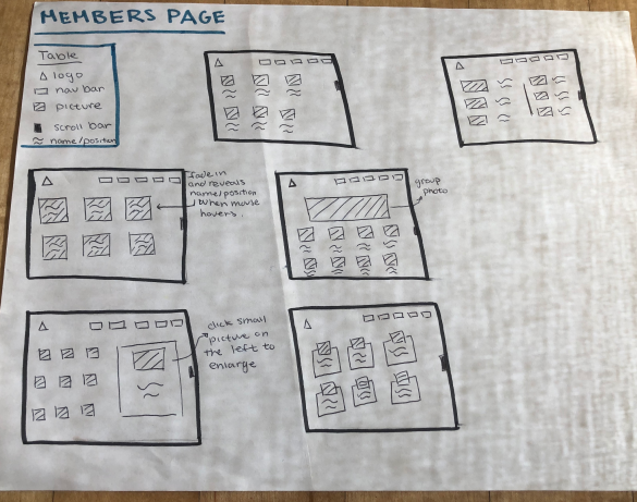
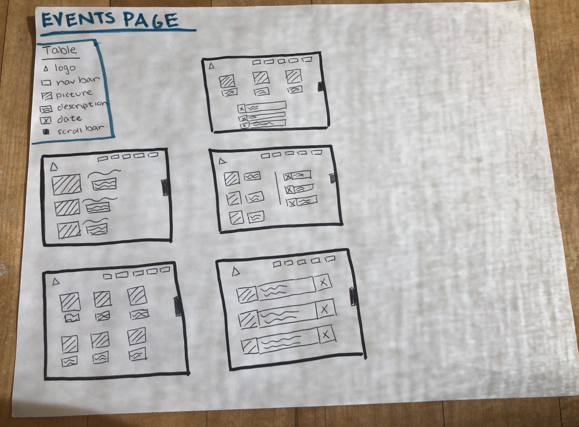
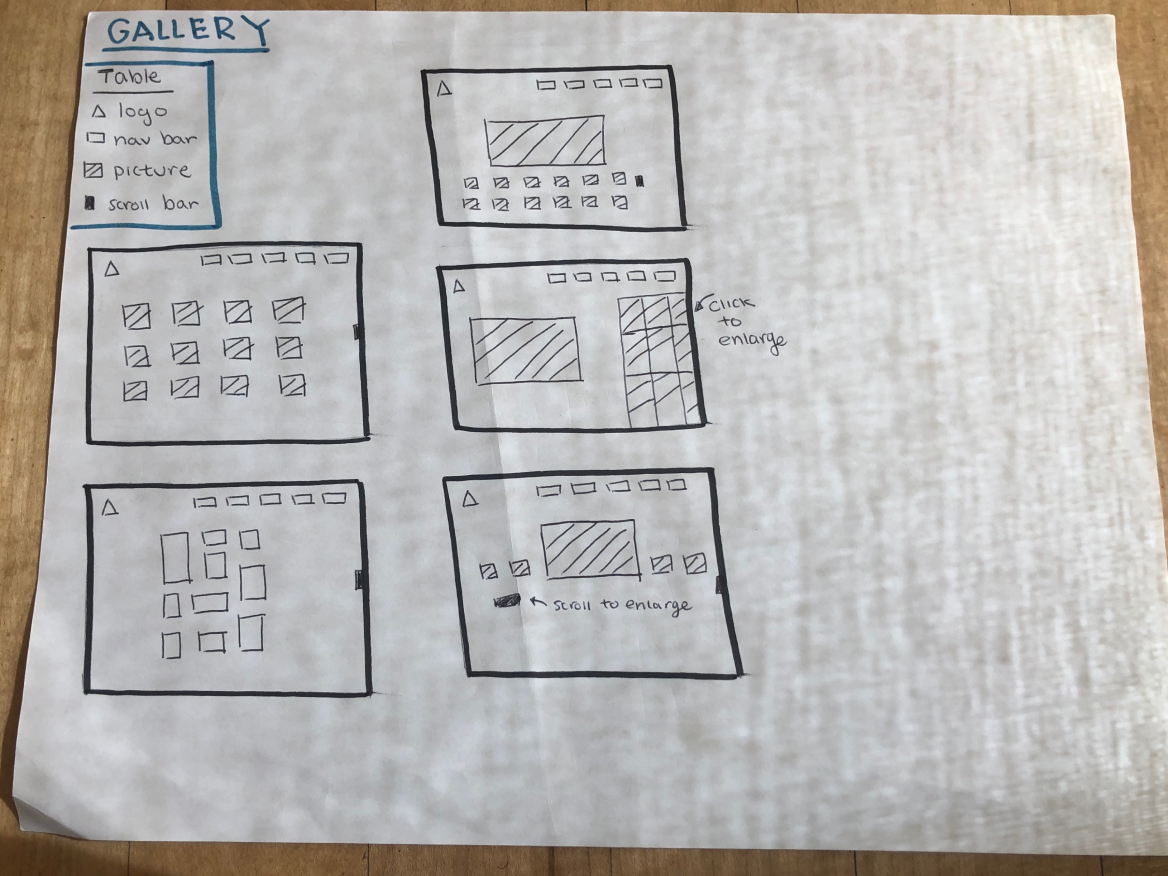
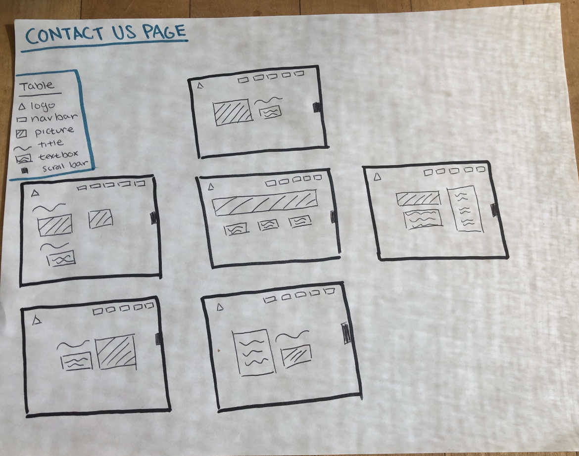
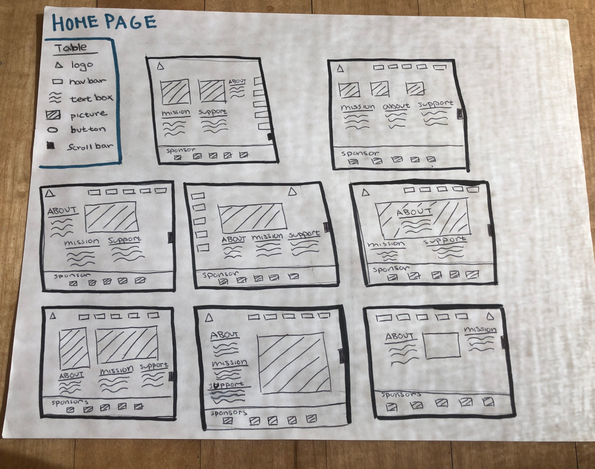
Midfidelity
After sketching out my ideas on paper, I referred back to the personas and created a sitemap to think about what content merits the homepage coverage. Users rely on navigation bars to find the information they are looking for. By identifying user’s needs/frustrations based on raw data, I curated and ordered categories for the navigation bar for successful homepage usability.
Integration of HTML and CSS
In order to keep the content and elements of the website organized, I built the site based on the aurora grid system. By taking into account the primary and secondary stakeholder’s concerns, I was able to create a flexible and responsive layout.
When designing the website, I took into account that how some users might want to view the website on smaller screen sizes. For the mobile view, I decided to add the hamburger menu. It brings to focus the information laid out on homepage where most users who visit the site for the first time can learn more about who we are and about what we do.
I created square icons for the businesses that have been sponsoring our organization for the past few years. Users are not only able to hover over the image to see the name of each business but also click on the image which will lead them to their main website.
final design layout
takeaways
I learned the importance of involving not only my team members through this design and development process but also those who were new to the website. I was able to understand the perspectives of different types of users and it made me think about how I should approach this project to cater to everyone’s best interest.
For the future, I would design a metric system to track the user retention rate on the website. You can visit the site on medicamp.ucsd.edu
For the future, I would design a metric system to track the user retention rate on the website. You can visit the site on medicamp.ucsd.edu
